Friday 28 December 2012

Bath Uni Brief - Resource Scarcity

The other Bath Uni brief that really interested me was about the scarcity of precious metals that go into the hi-tech devices that we take for granted. They talked in particular about smartphones and how it was currently too expensive to retrieve the metals once the phone is discarded.

My favourite soundbite was something to do with how a smartphone "contains around 17 of the rarest metals on the planet". I decided to mock up a poster to illustrate this fact, using gold foil on black, as gold is surely the first precious metal that people think of (I am not sure if it actually in smartphones - must check). I chose to use the recognisable silhouette of an iPhone 4 to represent smartphones. Here's a mockup of how it will look:

I figured this would look beautiful screenprinted using gold foil onto black card. Unfortunately there were lots of problems achieving the desired effect. First off I had to screenprint the foil glue onto the paper. I figured this would be the same as printing regular ink but alas no. Firstly, the foil glue is much thinner than the inks. Secondly, it dries into the screen in under a minute. I had to use the power-washer to get the glue out, which had the unfortunate side effect of stripping the stencil too! So, I made my screen up again and had to print the glue as a one-shot deal - no time to do a few tests on newsprint.

Once the glue is on the paper, you leave it to dry completely. You then apply the foil over the glue and put it into the heat press. Our print technician Ed had only done this once or twice during his second year, so it was going to be a bit hit and miss. Anyway, here is the result:

The cracked effect on the smartphone itself is quite nice but it is not what I was after - I wanted it to be totally smooth gold. I am quite pleased with the legibility of the text as it is quite small (12pt Myriad Pro) but unfortunately the "17" didn't print, so it doesn't make much sense. It is supposed to read:

Your smartphone contains around 17
of the rarest metals on the planet.

It is not currently possible to reclaim
these and reuse them.


I am not sure quite why all of the text didn't print. Perhaps it had something to do with the temperature or duration of the heat press. If the folk at Bath Uni like the idea then I will look into getting these printed professionally. At least I have done enough to prove the concept and figure out that doing it myself at uni is not an option.

My second attempt achieved about the same level of success. This time the factoid was about the precious metals that are deposited on the roads thanks to their use in catalytic converters. The actual quote I remember went something like:

The catalytic converters found in regular cars use a matrix coated in palladium, rhodium and platinum to filter out harmful pollutants. Over time, traces of these precious metals are released onto the tarmac.

It is estimated that there is currently more platinum on the roads of Birmingham than in the largest mine in the world.


Now, I know that this statement is not actually correct but it was something like that and I am only using it to illustrate an idea. I thought it would be apt create a map of all the roads in Birmingham using platinum foil, again onto black mount board. Here's the mock:

The map printed really nicely, although the text was not quite so good. Again, if the Bath Uni guys like this idea then I will look into getting it done professionally.

Bath Uni Brief - Chemicals

We were recently given the opportunity to work with Bath University on a number of live projects that aim to raise awareness of the important research carried out by the Centre for Sustainable Chemical Technologies. In particular, there were two briefs that I found very interesting. The first one was about trying to change the public perception of the word "chemicals", as it invariably has very negative connotations.

I immediately thought about the word itself and the fact that actually everything is made of the same basic chemicals - they are not always synthesised in a laboratory. So I got to thinking about things that people instantly associate with being the opposite of man-made or artificial, things like apples, water, fluffy yellow chicks, flowers, etc. I think this idea has legs, now just for the tricky part of representing it in a graphical way.

I figured the apple would be a good starting point, so I bought a lovely specimen and headed down to the photography studio. It was at this point that I contacted the boffins at Bath Uni to get an idea of the actual chemical composition of your average apple. Here's the first poster idea that I came up with:

Okay, so the brown leaf on the apple looks a bit ugly but at this stage I just want to test the concept and see what the Bath Uni lot think about it. I can reshoot a more perfect specimen at some point in the future.

I then got the idea of running the posters in pairs, both identical apart from one says "100% Natural" and the other "100% Chemical".

I imagine these posters on bus stops all over town, so I have mocked up a few examples of how they would look in situ:

I don't think that the poster design is by any means final, I just wanted to test the concept and get approval before taking the project forward.

Friday 21 December 2012

Swearing Budgies of the World - Drawing Styles

I have drawn my first two budgies and am quite happy with them. Here they are:

That's my first idea. I have also done a version of both of them without the thick black outline. I am not sure which style I like best. Opinions anyone?

Swearing Budgies of the World - Poster Idea

I knocked up this prototype A2 poster using one of the budgie illustrations I did for Artshole.

This is Beppe from Italy and he is doing a swear, in italian. I am pretty happy with the overall layout. I think that the stamp in the top-left corner could do with being an actual stamp, so I will look into getting one made up. I might add a flag of Italy, or perhaps a little outline map of the world with Italy picked out in solid black, like you might get in a book about birds. Yes, that would be a nice touch. Very graphic.

I am still to decide on the actual illustration style for the budgies - all I know is that I want it to be a consistent set of twenty. I think my next step is to experiment with my Wacom and Illustrator and see what I come up with. That's primary research right there.

Swearing Budgies of the World - The Swears!

I love swears, especially creative or traditional ones, so I spent a fair bit of time compiling a list of all the greatest insults and rude words in the world, then checked them with friends and other resources to check that they were really used in the countries specified.

Here are the best ones I found for each of the budgie nationalities I have chosen. I have included translations here, for your pleasure, although I think I will leave them out of the book/posters:

France - Putain de merde! (literally 'whore of shit')

Netherlands - Kut! (cunt) and Klootzak! (scrotum)

Italy - Vaffanculo! (go fuck yourself) and Fatti una pugnetta! (have a wank)

Germany - Arschloch! (asshole), Arschgefickter! (ass-fucker) and Fick deine Mutter! (fuck your mother)

Spain - Joder! (fuck) and Coño! (cunt)

Russia - Хуй тебе в роть! (a dick in your mouth) and Заткнись, иди на хуй! (shut up and fuck you)

Poland - Kutas! (prick) and Odpierdol siê! (fuck off)

Czech Republic - Hovno! (shit) and Piča! (cunt)

Denmark - Rend mig i røven! (fuck me in the ass)

Ireland - Póg mo thóin! (kiss my arse) and Dúil mo bod! (suck my dick)

Japanese - くそったれ/kusottare (literally 'shit drip') and 屁こき/hekoki (farter)

For good old Joey and Peter from the UK, there are loads of brilliant swears to choose from. I will probably go with something from this list:

  • Bellend
  • Minge
  • Tits
  • Prick
  • Ballbag
  • Shithead
  • Wankbag
  • Twat

Swearing Budgies of the World - Names & Nationalities

After a lot of research and a painstaking process of elimination, here are the names and nationalities of the twenty swearing budgies that will feature in my project (in no particular order):

  1. Joey (UK)
  2. Peter (UK)
  3. Joost (Netherlands)
  4. Pieter (Netherlands)
  5. Pierre (France)
  6. Beppe (Italy)
  7. Pietro (Italy)
  8. Josef (Germany)
  9. Pepe (Spain)
  10. Pedro (Spain)
  11. Iosif (Russia)
  12. Pyotr (Russia)
  13. Józef (Poland)
  14. Piotrek (Poland)
  15. Pepča (Czech Republic)
  16. Petr (Czech Republic)
  17. Peder (Denmark)
  18. Seosamh (Ireland)
  19. ヨセフ/Yosefu (Japan)
  20. 日多/Petero (Japan)
Okay, that's that sorted. Now I just need to come up with some brilliant swears for each of them. Should be fun...

Swearing Budgies of the World - Initial Idea

I have been struggling to come up with inspiring project ideas of late, so I was delighted when the Swearing Budgies of the World popped into my head. It didn't exactly pop fully-formed though. I was thinking about my pages in the Artshole 'zine and how much I enjoyed drawing budgies accompanied by surreal statements. I figured it would be nice to try drawing budgies in different styles, other than the two I did for the 'zine. My idea was for a series of, say, perhaps 20 budgies that would eventually form a rather lovely book. And then it hit me...

When I was a young lad in the 70s and early 80s, a few of my friends' grandparents kept pet budgies. Now, and this could be the effects of time on my poor brain, I seem to remember that they were nearly always called Joey or Peter. Sure, there were probably a few exceptions but by and large that was what budgies were called back then. So I started thinking that it would be nice if all the budgies in my book were called Peter or Joey.

And then my second flash of inspiration struck - if the budgies are theoretically from all around the world, they could have a regional version of the two classic names. So, in France we would have Pierre, in Spain Pedro, in Italy perhaps Beppe, being a shortened informal version of Giuseppe (Joseph). Suddenly I had the makings of an original and interesting project. I compiled a list of countries and found the ones with the best Joeys/Peters. Some of them were too close to the English to be interesting - the French for Joseph, for example, is Joseph, albeit most likely pronounced "sho-seff" by a sexy lady smoking a Gauloise. A French budgie would probably be swearing too... OMG!

That's it! An added layer of pleasure could be had by having each budgie swearing in his own language! Budgies and swearing in one project, what could be better? This idea is so strong that I think I will make a series of A2 prints as well as a book.

Friday 14 December 2012

Thursday Lecture - David McKendrick

David McKendrick is the Creative Director at Esquire magazine. He jetted in from New York for the lecture and apologised in advance in case he was not quite with it.

David's design career started when he joined Graphic Thought Facility (GTF) straight out of uni in 2000. He describes the job as something of "an extended apprenticeship" and says that he was "a bit of an arse-licker for a while", taking on all the tedious jobs that no-one else wanted to do. This seems to be a pretty good way to get on in a company and it wasn't long before he started to get asked to do some of the more interesting work.

In 2004 David joined North and quickly learned about the particular issues that arise from working with more corporate clients. He was brought in primarily to bring the GTF style to the staid world of the corporations. He showed us a branding campaign that he worked on for a credit card provider called "Seven" - it was pretty unspectacular to be honest yet still took nine months to complete, which is apparently standard when dealing with such big clients. Must have been pretty boring. He mentioned that it was important not to show a client too many ideas as they tend to pick their favourite bits from each one with scant regard for how the whole will hang together. I have already experienced this in the past few years with web design.

From 2006 to 2007 David was hired by Wallpaper* magazine, where he was involved in some editorial design but mainly handled other projects and events that were outside of the magazine itself. This seems to have been a pretty creative time for him and he got to produce some really nice stuff working with large budgets. There was a good cautionary tale from this period too - never write bad stuff as placeholder text in case it accidentally goes to print! This also applies when giving files on your machine names like "website-for-asshole.psd".

In David's instance, a massive client (vodka brand I think) paid for a four page advertorial piece in Wallpaper*. When the first issues came back off the press, the headline at the start of the piece said something like "TEXT COLUMN". Suffice to say the company, who had paid a fortune for the piece, were less than impressed and Wallpaper* had to run the corrected version for free for the next few issues. Having worked in publishing, I am amazed that this can happen as there are so many people that look at the files before they go to print - art editor, production editor and editor at the very least. Despite this I have on numerous occasions seen the word "caption" under a photo in even the biggest newspapers and mags, or a line of "lipsum".

In 2008 David took on the role of Creative Director at Esquire. The magazine was looking tired and dated and was struggling to sell advertising (I didn't realise that it launched in 1939 in the US). David breathed new life into the mag by changing all of the typography as well as the photographic style, while making the whole thing look more structured and thus sophisticated. He also used a variety of paper stocks throughout the mag to further separate the distinct sections.

I personally love what he did with the covers. Each one is unique and playful in its design, while the subscriber-only editions are stripped right back and rely heavily on the strength of the photography. Check out the January 2013 covers for an example:

Many of the covers made interesting use of typography, based on the cover star for the issue. Look at what they did with the logo for the Lewis Hamilton issue:

I also like how playful they were with the barcodes on some issues. The one for the Kaka (Brazilian footballer) issue was particularly nice:

When Alex Bilmes took over as editor of Esquire UK in 2011, David feared that his time at the magazine may have come to an end - new editors often bring in their own teams to put their stamp on a publication. In fact, David had known for some time that a new boss was incoming, so he actually did some of his most daring design work, free as he was from any fear of consequence. As it transpired, he and Bilmes shared a vision of where Esquire should be headed and agreed on a revamp that would make it appear less exclusive in order to appeal to a broader market. There is no doubt that the subsequent redesign was nowhere near as beautiful as the previous one, but at least it looked much nicer than the other "lad mags" that were vying for the same readership.

There was however still some room for good creative design. I particularly like the way that David tends to tailor a design to make it appropriate to a particular feature. For instance, a feature on meat sees all the pull quotes handwritten on those little plastic signs that butchers stick into a joint of meat or pile of chops.

David finished up by sharing a few pearls of wisdom from his design career:
  1. Don't get involved in office politics
  2. Don't shag anyone at work
  3. Make the most of your opportunities (like he did at GTF)
  4. Get inspiration elsewhere - try not to look at other design (I hear this a lot)
All very useful I am sure. Shame he was too tired to go for a pint...

Tuesday 11 December 2012

A Research Trip to London - Day III

I set off bright and early to try to cram as much as possible into my last day in London. I took the tube to Vauxhall with Morrissey on my mind and walked past the imposing and hideous MI6 building on my way to Tate Britain. I got there just after nine and then found out that it opens at ten!


So I had an hour to kill in a really dreary part of London. I wandered around for a while, looking for somewhere to grab a coffee and a newspaper but there really was nothing around. Eventually I stumbled across a depressing cafe situated at the bottom of a depressing tower block and got a coffee and a croissant.


I find these concrete and steel towers to be really depressing on a grey, drizzly day, yet they can look so beautiful against a blue sky with the sun glinting of the windows. With an hour killed I headed back to the Tate and went inside. I wasn't sure what to expect as I usually go to the Tate Modern but I feel I have seen everything there a few too many times now.

On the ground floor there was a massive exhibition of Ian Hamilton Finlay. I must say I was underwhelmed by the majority of it, although some of the large 3D type installations were quite interesting. I moved swiftly on through a huge room filled with classic British art. John Martin's massive apocalyptic scenes were really impressive and I stood staring at them for quite some time:


He must have been a fun guy to chat to at parties. I then wandered through a section of twentieth century painting and sculpture and was really impressed by this piece of classic Gilbert & George:


Seemed so strange that they had walked past me on Brick Lane the day before. I also really liked seeing the infamous "George the Cunt and Gilbert the Shit":


Another artist whose work I have always admired is Patrick Caulfield, so it was great to see some of his stuff full-size. I particularly like this piece and wonder if I might try to do something similar, combining photography and 3D/vector graphics:


I was feeling pretty inspired by this point, and generally impressed with everything I saw at the Tate. And then there was this:


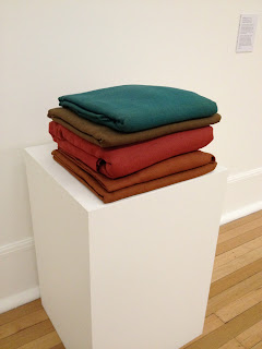
This is Barry Flanagan's "Pile 3 '68". Pile of wank more like. How the crap does stuff like this get put on display in a gallery? I think it actually takes the piss more than Emin's "Shitted Bed" or Carl Andre's bricks. Apparently these "expressive cloth sculptures were a vehicle for investigating the behaviour of three-dimensional form, free from traditional notions of sculpture".

This proves that in art you can get away with pretty much anything providing you write a bunch of nonsensical bollocks to justify it. Perhaps I am just not cultured enough to "get it". Wank. Luckily my faith in art was restored when I walked into the next room and discovered a brilliant artist I had not heard of before.


This is Leadenhall Market by William Roberts. He made this in 1913 when he was just 17. I love the constructivist style and the muted tone of this piece in particular. It has a draughtsman-like quality that I really love. There were loads of other pieces by him in the large room, but I found that his work got less interesting as he got older.

I had a lot to cram into my final day, so it was time to move on. On the way out I walked down this beautifully painted staircase:


Next I headed to Euston and the Wellcome Collection to see "Death: A Self-Portrait"; a macabre collection of artworks and artefacts related to death that was being advertised all over London. There was some interesting stuff but I think I was most impressed with how the exhibition was curated and advertised. The information leaflet that accompanied the exhibition was designed to look like an order of service for a funeral. Nice attention to detail.


Morbid curiosity drew me to this exhibition, as I am sure it did many others, but death and mortality are things that occupy my mind a lot of the time so I probably would have benefited more from some distraction. There was a "nice" piece of infographics on the way out though, which showed causes of death in the twentieth century:


For a bit of light relief I headed upstairs to see the "Medicine Man" exhibition, which contained, among other ghastly things, a wide selection of authentic torture chairs and amputation saws. The Japanese in particular seem to have taken torture very seriously. All this death was making me hungry, so I headed for Soho to try a little place called Hummus Bros on Wardour Street.


I can highly recommend this place. The food was great and pretty cheap and the pittas were so fresh and hot from the oven. The main dish was a ring of gorgeous home-made hummus with a spicy beef stew in the middle. Different and totally delicious. After this wonderful feast, I made my way to the Barbican to have a look at the Rain Room. The Barbican was a bit of a pain to get to but it was worth it if only to enjoy the beauty of the building itself - it's like a 1960s Dutch airport!


There was a queue for the Rain Room but luckily it stretched nowhere near as far as the sign which stated "approximate queuing time from this point is 2 hours". I had walked in from the pissing rain to queue to walk through a Rain Room! I only had to wait about 15 minutes before I was ushered through a long, dark, curving corridor, I could hear the rain around the corner, which was strange, and the shadows of people on the walls looked haunting. Upon rounding the corner I reached the Rain Room itself. Basically it's a bunch of camera/sensors on the ceiling coupled to a bunch of sprinklers. When you walk underneath a sensor the associated sprinkler turns off, so you should remain dry. In theory.


The staff were only allowing a handful of people in at a time, otherwise I guess all the sprinklers would switch off, ruining the effect. Of course the group before me seemed to stand there fannying around forever. Yes, the rain stops as you walk through - get over it! Before I was allowed in, someone informed that I might want to take my black coat off as the sensors would not pick me up and I would get a soaking. Unfortunately I was wearing only a black shirt beneath it, so I kept my coat on and headed in. And got soaked! I managed to stay dry for a while by standing next to other, more brightly-attired people, although I soon got bored and made a dash for it. I must say that this indoor rain was very wet.

As I left the Barbican it was starting to get dark and I was aware that I only had a few hours before catching my train home. I still wanted to check out the Saatchi Gallery so I hopped on a tube to Sloane Square. I wandered around this ultra-posh area for quite some time without finding the gallery. Eventually I asked someone if I was in the right neck of the woods and they told me that I was stood outside where the Saatchi Gallery used to be. Apple's maps app strikes again. I was now getting really short on time so I headed off in the right direction and found the place at last:


I didn't really have the time for a leisurely stroll about the place, so I dashed around a collection of suitably depressing Russian photography, much of which seemed to consist of massive prints of naked tramps with hideously diseased cocks. Lovely. When I went back downstairs to the cloakroom to get my backpack, I noticed the distinct smell of sump oil. Of course! I almost forgot that this is where Richard Wilson's 20:50 was situated; something I had wanted to see for a long time. It didn't disappoint and I was lucky enough to be alone in the room, looking down at the beautifully-reflective void and contemplating death (again). It is a bit of a shame that some arseholes feel the need to drop things into it, spoiling the perfection of the surface.


And that was about it. I headed straight for Paddington just in time to catch my train home. This had been a really useful three days, hence these immense blog posts. I saw loads of great stuff and some shit, like the pile of blankets. Oh and there were these horrendous Christmas lights on Oxford Street:


Marmite? Really? If you are going to sell Christmas to the highest bidder then at least pick something that is at least relevant to the season. Perhaps Cadburys? Or Smirnoff? Heck, even Bernard Matthews! At least Carnaby Street and Chinatown made more of an effort:

Monday 10 December 2012

A Research Trip to London - Day II

I set off early in the morning to continue my inspirational tour of London. I arranged to meet a friend for breakfast in painfully fashionable Shoreditch as I wanted to check out KK Outlet and White Cube in Hoxton Square, as well as Whitechapel Gallery and Brick Lane in general. I took the tube to Old Street and was instantly struck by a series of really simple posters that were all over the station:


These were all the way down the stairwells, on both sides, and there were massive A0 versions in other parts of the station. What could it mean? The payoff came in the shape of another bunch of posters, all stating "WEAR SNEAKERS". But it didn't end there. The two messages were united on a further set of posters, along with the Converse logo. What a brilliant ad campaign. Must have cost them a fortune. I really like when a campaign has been designed for a specific location.

It didn't take more than thirty seconds from stepping off the train before I spotted my first hipster:


Within minutes I had spotted my second:


By the time I left the station they were everywhere, like an ironic-jumper-and-facial-hair zombie horde. Still, they are harmless enough. I met my friend as planned and we walked along to Hoxton Square in Shoreditch, where we grabbed a bite and a cuppa at The Breakfast Club. Everyone was painfully fashionable but pleasant enough and there was this rather brilliant He-Man wallpaper in the toilets:


After eating we headed around the corner to White Cube, where there was an exhibition by Harland Miller called "The Next Life's On Me". It's a really nice space and the paintings were like huge paperback book covers (I think Miller is also a writer).


Next, we walked across the square to check out the KK Outlet store.


I thought the place was just a shop, albeit one chock full of beautiful independent publications, but it turns out it is also a gallery. There was a rather brilliant exhibition on called "Logo R.I.P." which was basically a series of photos of gravestones featuring well-known logos that are sadly no longer with us.


After KK Outlet my friend and I went our separate ways - he headed off to work and I strolled down Brick Lane in search of the best "best curry in London". While I was looking at one of the £6.95 two-course lunch menus, I noticed a couple of dapper gentlemen walk right past me:


It was only Gilbert and fucking George! I dashed after them to get this cheeky snap. I was more than a little starstruck when I finally sat down to eat. After lunch I walked all the way down Brick Lane until I reached the Whitechapel Gallery. I was interested in seeing Mel Bochner's typographic work, as well as the general collection in the gallery.


Bochner's brightly coloured word chain images were quite nice but nothing really special and I did quite like posters made from shaving foam sculptures that were beautifully lit and photographed, something I must try at some point, but the rest of the stuff in the gallery was pretty boring and/or pretentious art wank.


That was enough art for the day, so I went and met my cousin on Oxford St and then went for a few early-evening drinks around Soho. Once we were a bit wobbly we hooked up with some other friends and walked through loads of interesting back streets until we arrived at a fantastic pop-up burger joint in Covent Garden:


We then headed back to Clapham, stopping for a last drink at a very fancy bar where they charged me £11 for two pints of ale - it was only £3.50 a pint just off Oxford Street! Still, they did have a lovely Jeff Koons print on the wall, which sort of made up for it (a bit):


More tomorrow...